The Problem
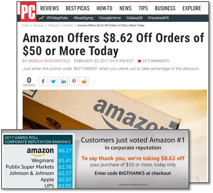
It’s true that Amazon had the highest average "reputation quotient" score of 86.2%. The 2nd highest was Wegmans with 85.4%. But statistically, there simply isn’t enough data to prove Amazon deserves that top spot. In fact, it could be argued that they are statistically equal with all the other companies in the top 10 list.
Analyzing the Data
In Harris Poll's description of their measurement process, they brag that they surveyed over 30K people – that's no small feat! However when you look at the details, they only surveyed 300 people per company. So unless I misinterpreted their methodology, each company’s score is based only on 300 unique surveys. So although Amazon did have the highest portion of their 300 who ranked them highest, that sampling is not big enough to prove they’re statistically higher or better than the others in the top 10. How can we know that? Some simple statistical tests can help validate it and an interval plot can be a great way to visually illustrate the data.
What is an Interval Plot?
Below is an example of an interval plot. The purple dots are the averages (or means) from the sample data, and the vertical lines extending from them represent the margins of error (or confidence intervals). From a statistical standpoint, you interpret the data by saying "the sample average is X% (the purple dots) but we can be 95% confident that the true population average falls somewhere between Y% and Z%" (the red and green lines that reflect the margins of error).
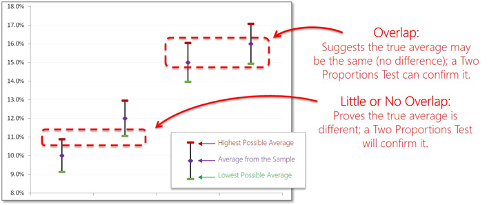
What makes this interval plot so useful is that you can compare how much overlap there is in those margins of error between the items you're comparing. That is, if the items you're comparing have a lot of overlap, then the population averages may end up being about the same (suggesting no statistical difference between them). Likewise, if there is little or no overlap, then you can be more confident that the population averages will be statistically different. In either case, a Two Proportions Test may be helpful to prove that statistically.
What about Amazon's Data?
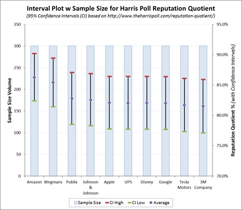
Here is the interval plot based on what we know from the Harris Poll data. For Amazon to be the “highest”, their score minus their margin of error should be above the score and highest margin of error for other companies. However, since there’s so much overlap in the scores & margins of error across these companies, this data shows Amazon scored about the same as the other top 10 companies. A Two Proportions Test between Amazon & Wegmans yields a p-value of 0.76! In layman's terms, that means there’s a 76% chance of being wrong when Harris Poll claims Amazon to be #1. Ouch, how embarrassing!
Be careful though. This does not mean Amazon is not the highest or not deserving of the top rating; it simply means there’s not enough data to prove they are the highest. If they acquired more samples, then the margins of error would shrink and we may be able to see more distinction (less overlap) between each company.
Did Amazon Misinterpret this Data?
I highly doubt that Amazon misinterpreted this data. Amazon didn't get to be as big as they are by not knowing how to analyze data. My opinion is that they probably knew there wasn't enough data in the Harris Poll to prove they are the highest rated, but they took advantage of the poor data representation that the Harris Poll made. That is, since the Harris Poll didn't represent their results in a statistically valid way, Amazon probably took advantage of that to promote themselves, generate some more revenue, and get free publicity. That's good business sense! However, if I were one of the other 9 companies in the top 10 list, then I'd challenge the Harris Poll's results and demand they represent their data in a more statistically valid way.
About StatStuff
StatStuff is the only FREE source for complete Lean Six Sigma training. It is highly endorsed as quality Lean Six Sigma training from leaders at top companies like Apple, eBay, Pepsico, Bank of America, Dell, Sprint, BP, etc. Many other training organizations offer similar LSS training content for $2,000 - $7,000 and their training lasts 40 to 200 hours long. StatStuff’s free online training content is less than 28 hours – plus StatStuff offers Beginner and Intermediate training paths that can be completed in far less time. Many companies, training organizations, and universities are using StatStuff for their training curriculum. And why shouldn't they? There’s no risk, it’s less time, less money, and what better way is there to teach Lean Six Sigma than to apply Lean Six Sigma to their own training plan?